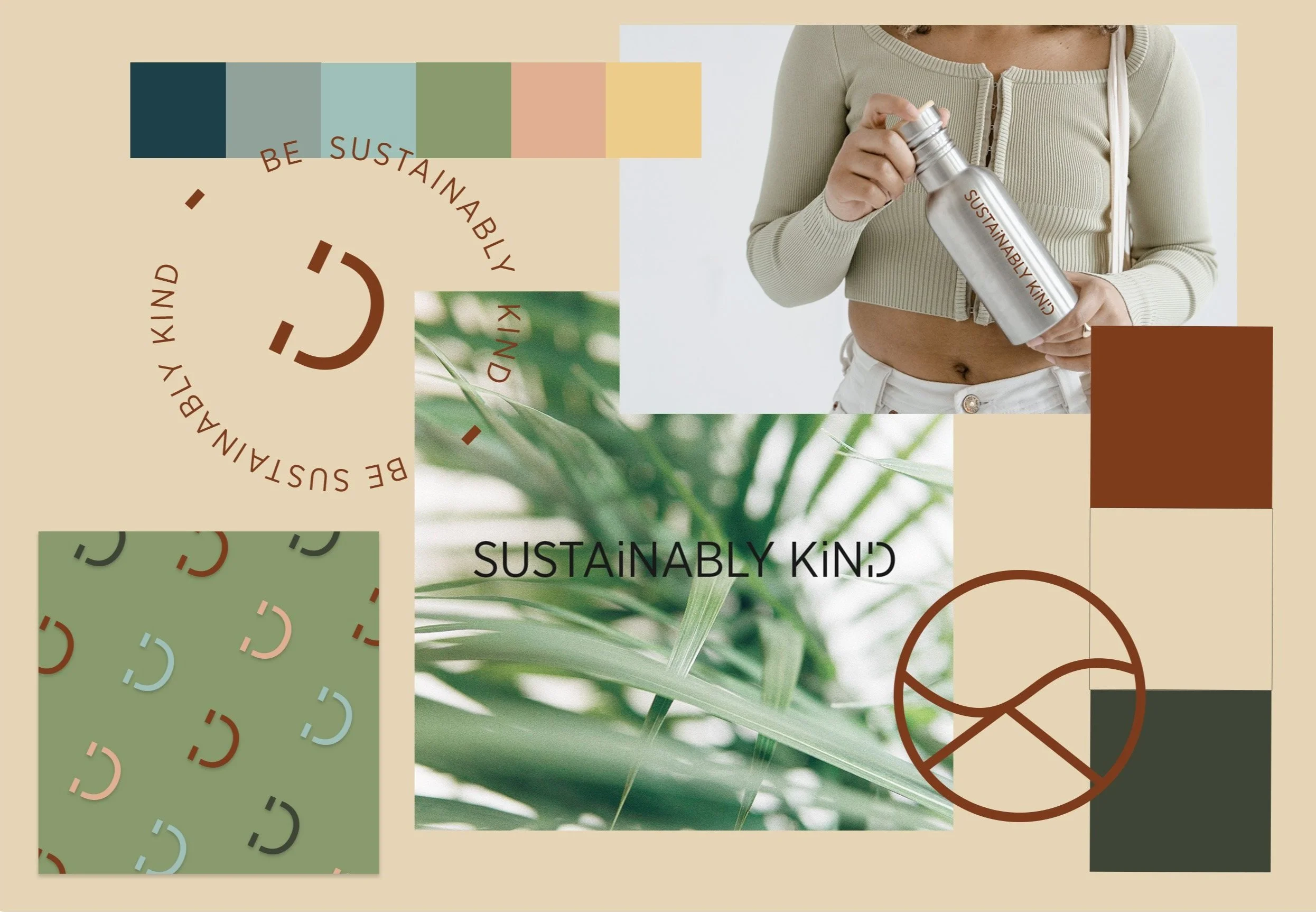
Sustainably Kind
Sustainably Kind is an environmental consulting firm that wanted to remind you why we need to protect the planet through its design. I was able to start from scratch for this brand identity exploring the most authentic way to visualize this company.
I wanted this brand to feel inline with nature while still having a few accent colors. While it is about sustainability the brand still needed to feel sophisticated to appeal to an upscale client. While the colors utilize muted primary colors and more playful secondary colors as accents.
https://www.sustainablykind.com/
S E R V I C E S
Brand Identity
Logo
Website
Social Assets
Email Campaign
Pure · Serene · Inspiring
The Logo
The logo uses a clean, slender san serif that is sophisticated to make the brand feel upscale yet relatable. While the font is a mature style it incorporates a few playful additions.
I created the lower case i to remind viewers that no one “I” alone can change the world but instead we have to do it together.
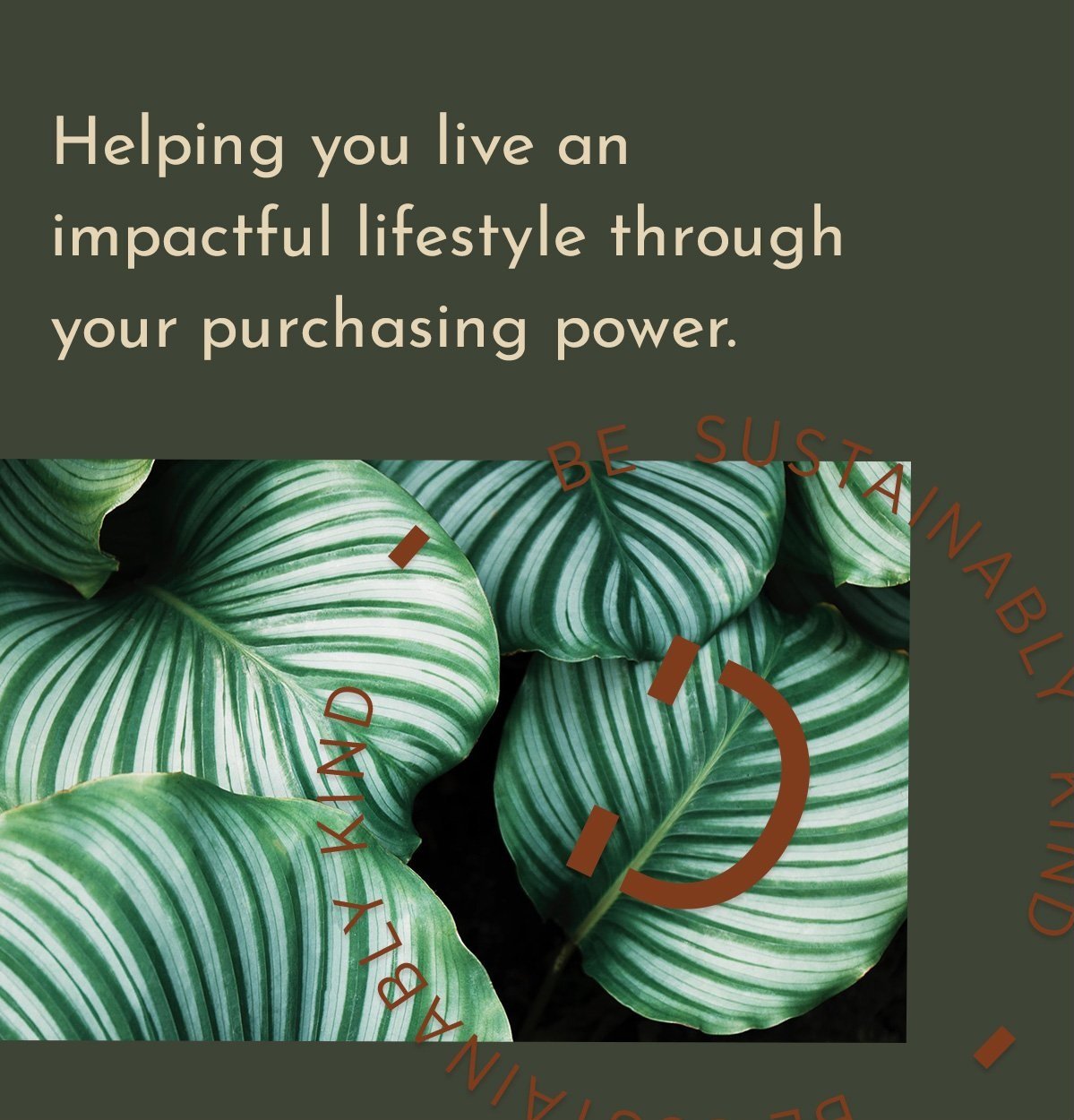
While the D creates a more playful space with a smile. Reminding us that although this is a serious topic, we can have fun while being kind to this planet.
The Color Palette
The color palette uses a muted natural tone of red and green as its primary color palette. These two colors are inspired by forest and the rock formations at Antelope Canyon.
It then brings in brighter colors for accents that allow the design to feel lighter.
I was able to get inspiration for these color tones from the sky, ocean, forests, and rock formations allowing the colors to blend perfectly with images used.
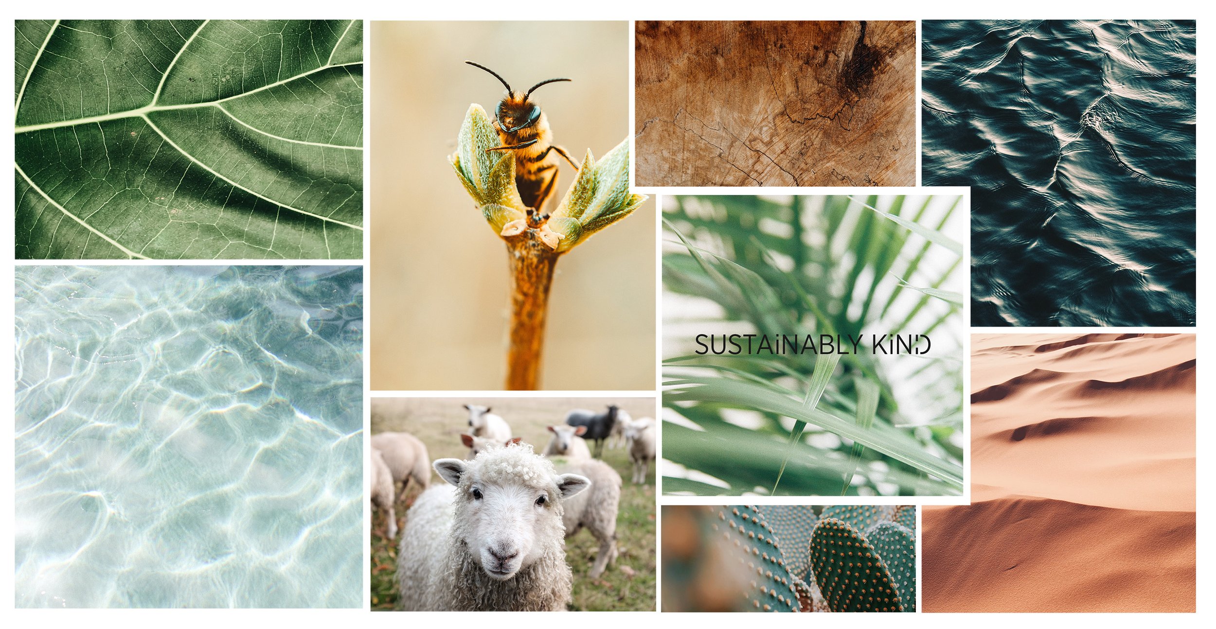
This brand identity is photography heavy. We want to allow these photos to inspire the viewer. So to help incorporate more images I zoomed in and allowed them to create textured backgrounds. These close up shots allow the viewer to see the life in nature. Weather thats veins on a leaf or wrinkles in the ocean waves.
